

Pharmacy zur Taube
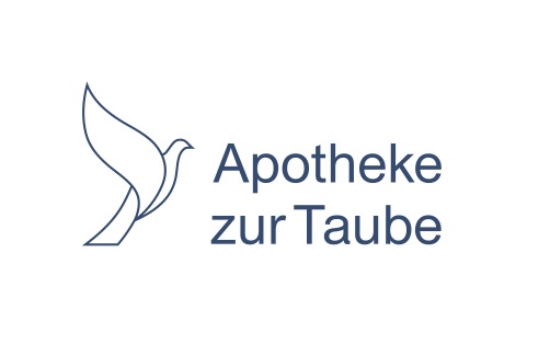
The pharmacy zur Taube in Küssnacht am Rigi asked for a redesign of the logo, as well as the business cards and the stationery. The original logo was quite old and no longer conveyed the pigeon's positive attitude and health. For the end product, I only rely on the outline of the pigeon and the color blue, which is considered positive, healthy and calming. The pharmacy cross fell away because the cross was always and everywhere visible and the dove and its message dominated.
November to December 2018, Pharmacy zur Taube
 English
  Deutsch